When we first discussed our packaging designs, there were two things we knew it had to have.
1 - Less impact on the environment
2 - An instant understanding of the mood that each scent would give you, by just looking at the packaging and design.
Vilunü’s name means the blue hues found in Maldivian lagoons. Even our logo has a reference to water and salt, so we knew our packaging had to be based on the textures of water colour. So we first made a series of abstract watercolour patterns by hand, based on three scents that we had confirmed at the time.

After combining them with some product layouts, we weren’t so happy about the design. They didn’t communicate the clean look that we wanted to achieve so we went back to redoing the designs digitally. After a few tries, we hit something that seemed like it could work.

We printed and tested out a few different variations of this design. Using our sample packaging, we tested out different layouts before finding something that represented our brand well enough.
Our first scent, Tangerine & Guava Leaf combines a zesty burst of citrus with guava leaf tones — we wanted this to be reflected on the label through the colours and patterns. A combination of greens and yellows, blended with our brand colour (we’re gonna call this the vilu-blue colour) perfectly visualises the mood of this particular scent.

The design for this first scent then became the base, on which we developed the rest of designs for the four scents we currently make. From the spicy warm scent of Jasmine & Cinnamon to the tropical fresh, energetic burst of the Passion Fruit & Green Leaf, if you take a look at each of the scent labels, you can see how they visually capture the mood, “rhythm and feel” of each scent.

Approaching our labels this way has helped us create a set of packaging designs that is true to each scent mood, with the hints of “Vilu blue” colour peeking through in each design and has a consistent layout. In addition to this, we actively seek to style ties it all together to our brand, no matter the scent.
So what about environmentally friendly?
We made a collective decision to make our packaging biodegradable wherever we have the option to do so. It is for this reason that our diffuser packaging does not have a foiling or UV finish or any lamination effect.
While we agree that it does add to a luxurious look, we could not go ahead with the plastic film that would cover our boxes. 
Our hand cream tubes are made from 50% PCR (Post Consumer Recycled) plastic materials. The labels on the hand creams are made from a biodegradable material. Wherever possible and affordable, we have opted to use materials that will have a lesser impact on the environment.
Being a smaller company it is often harder for us to meet the price or minimum order quantities of more environmentally friendly materials and methods. So instead, wherever we can, we try to repurpose any materials.
We take the packing materials included in our supply shipments, and repurpose them to be used in our gift boxes as buffer packing material. We also reuse the cardboard boxes sent by our suppliers to transport our products to our stockists.

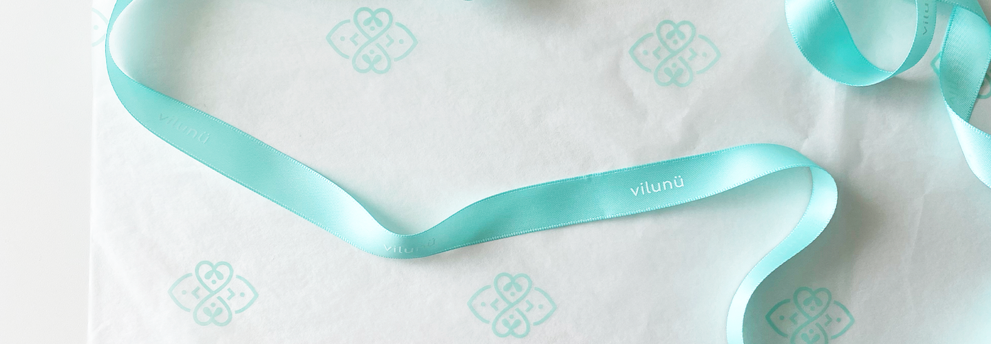
These are some of the simple ways through which we have tried to prolong the usage of materials before it goes into waste. However, with each new production run we do, we constantly check to improve our packaging. We have recently switched the tissue paper material used in our gift box to packing tissue paper that is FSC certified and printed using soy inks.
Perhaps one of the perks of being a smaller business is that we get to pivot a lot of our decisions faster than a bigger company. We have been enjoying this journey learning about eco-friendly packaging.
If you have any tips or ideas on how to make our packaging more eco-friendly as a smaller business, please reach out to us. We would be very grateful for any information you could provide us.
